Initiative
Bringing dark mode up to standard
Yandex Fleetroom
Michael led the effort to bring dark mode in Fleetroom up to standard – addressing a neglected feature with no clear owner or roadmap. Given that many users access the product in low-light environments, improving the theme directly impacted everyday usability.
He introduced system-level theme switching, improved contrast using existing tokens, and scoped updates to avoid regressions across a shared design system. He secured buy-in from key stakeholders and coordinated rollout across engineering and design teams. As a result, dark mode became stable, consistent, and widely adopted – improving the user experience without adding maintenance overhead.
Product
Fleetroom is a b2b platform used by taxi companies operating under the Yandex and Yango brands. It supports both b2b and b2c workflows, helping partners manage drivers, vehicles, and finances. Yandex primarily serves the CIS region, while Yango operates in select African and Latin American markets.
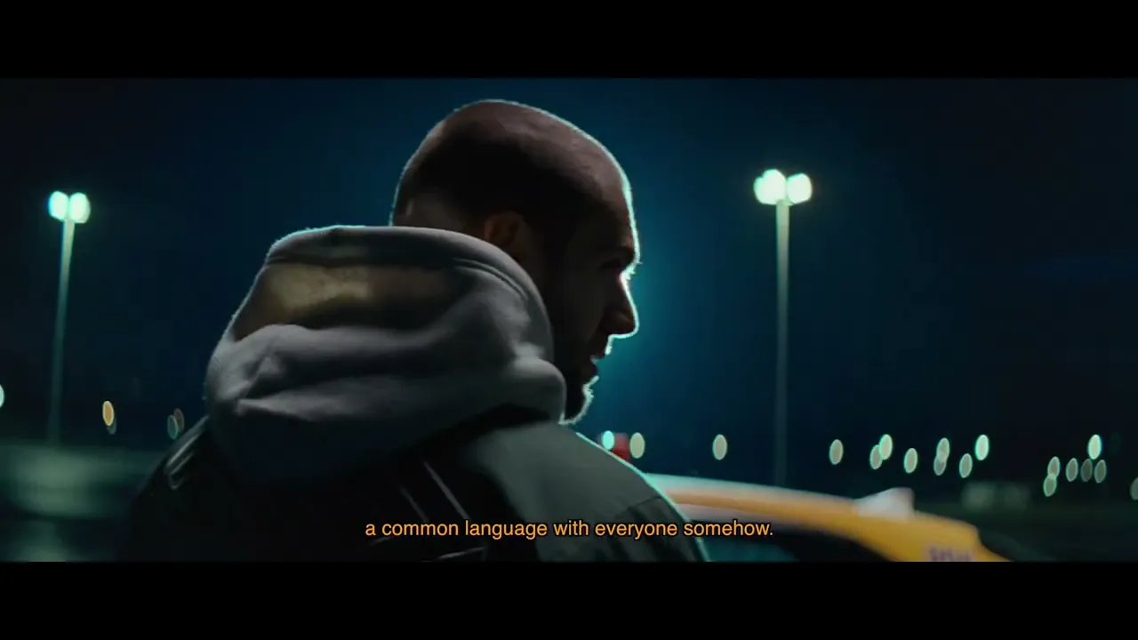
Human context of the product by Medialab. Michael was not involved in producton
Dark mode was available but not production-ready. It lacked system preference support, suffered from low contrast, and appeared visually inconsistent.
Fleetroom relies on a shared design system used by multiple products – in those products, dark mode had been fully disabled. The feature had no clear owner or roadmap, and no strong product case had been made for investing in a fix – even though the usability impact was noticeable in real-world conditions.
Removing it from Fleetroom risked breaking existing use cases, while fixing it required scoped changes to shared assets – with limited incentive for any team to take it on.
What he did
Michael initiated the effort to bring dark mode up to standard – despite the feature lacking ownership or clear prioritization.
He began by enabling system-level theme switching across all builds. While one white-label version already supported system preferences, others did not. Michael partnered with a frontend engineer to implement consistent behavior across builds.
He then addressed visual contrast issues. Many surfaces were darker than the background, flattening the hierarchy and reducing legibility. Rather than introducing new tokens, he reused existing ones – selecting improved combinations that restored structure and met contrast guidelines.
Because the palette was shared across multiple products, changes had to be scoped. Michael introduced a new variation within the token set to isolate the update and avoid regressions. He also updated core components so that dark mode worked by default – eliminating the need for manual overrides.
To drive adoption, Michael aligned with stakeholders across teams – securing support from his manager, convincing the owner of the shared palette to implement a new variation, and communicating the rationale to frontend teams across the business unit.
Result
Contrast levels were adjusted, hierarchy clarified, and component behavior made consistent. Surface values were rebalanced to avoid visual inversion, focus states became more visible, and layouts now present as intentional. The theme now behaves predictably and aligns with system appearance.
Outcomes
Adoption grew from approximately 5% to over 50%, primarily due to system-level switching. The change introduced no regressions or support load – dark mode is now stable, automatic, and fully integrated into the product experience.
Learnings
Improving dark mode was not a priority, but the effort highlighted how shared ownership can delay even straightforward fixes.
The case showed that low-effort changes, such as enabling system preference support, can meaningfully improve experience when executed with care and coordination. It also reinforced that small, scoped contributions to shared assets often deliver more value, and carry less risk – than broad, system-wide redesigns.
