July 2021 – September 2022
Summary
Led the user experience design and testing for Nite Overlay library integration, enabling day/night cycle functionality and a launch with wide media coverage.
Results
30,000+
Daily Active Users
90,000+
Montly Active Users
What I did
Competitive Audit
User Interface Design
User Experience Design
User Testing
Art Direction
Team
Head Web Developer
Product Manager
Product Designer (me)
Platform
Web
Product
Yandex Maps is a web mapping service for navigation and place search. The product has different data layers: traffic jams, street panoramas, live public transport markers, and more. Yandex Maps is the most popular mapping service in Russia, with approximately 11.5 million monthly users within the country and over 20 million worldwide.
Background
A cultural feature of people working at Yandex is curiosity and a desire to experiment. The head of web development in the Yandex Maps team was interested in checking if it was possible to apply the Nite Overlay library to Yandex Maps, as Rossen had already done with Google Maps.
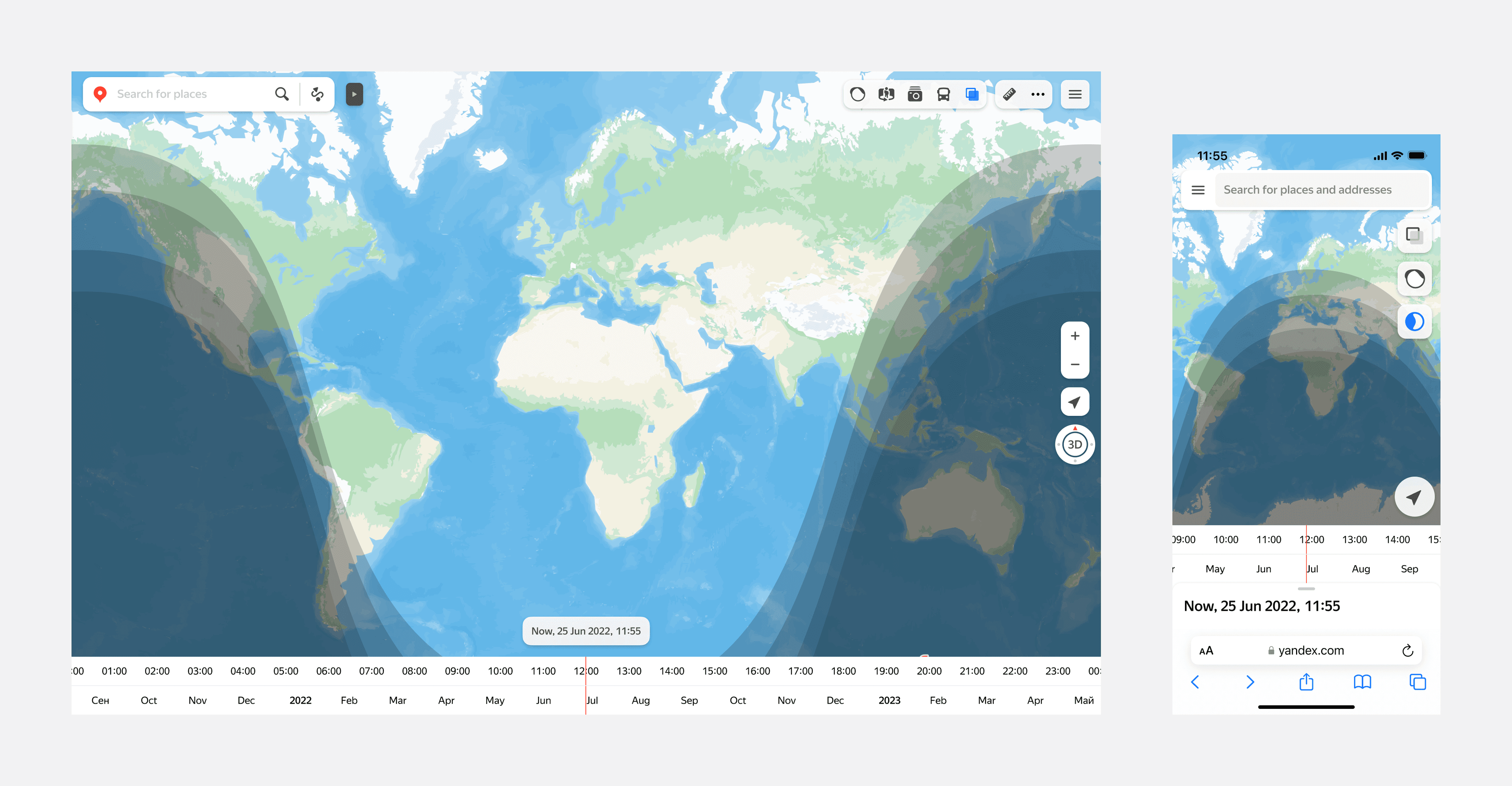
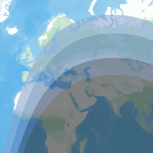
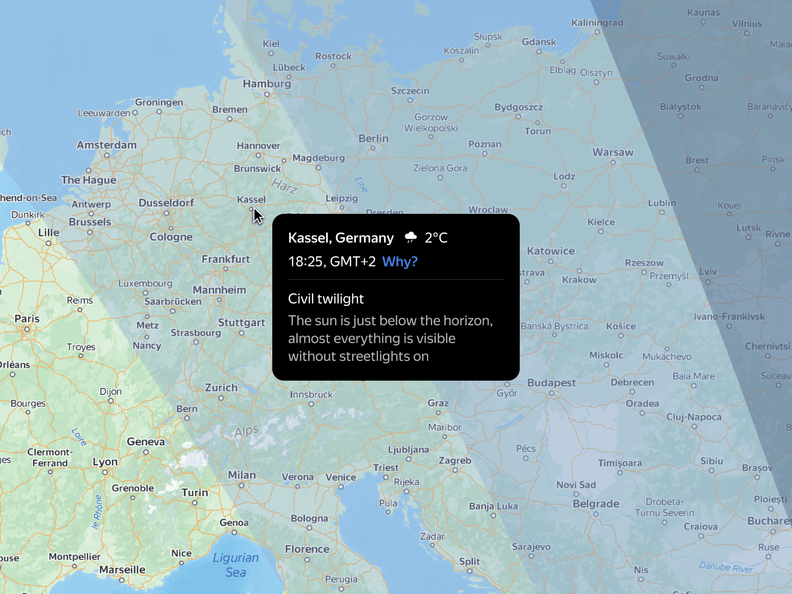
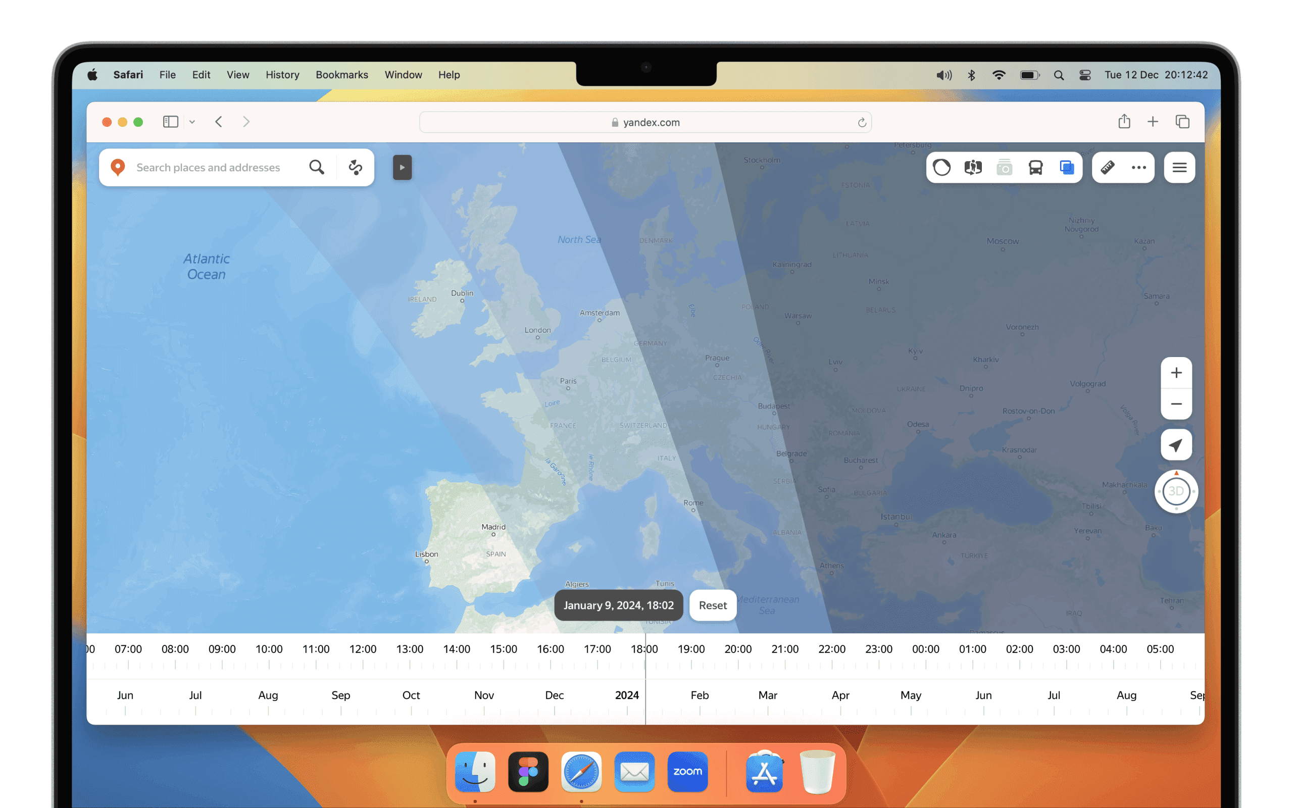
The Nite Overlay library generates an overlay to illustrate the day/night cycle. There are 4 shade levels going from light to dark. They are civil twilight, nautical twilight, astronomical twilight and night.
Goals
The company encourages workers to pursue pet projects on their own time. The project was seen as an experiment in a completely different direction from the company's usual focus on core products and services.
Of course, not all pet projects are successful. However, the potential benefits of encouraging pet projects are significant. By giving employees the freedom to explore their own ideas, companies can create a more innovative and productive workplace.
Market Research
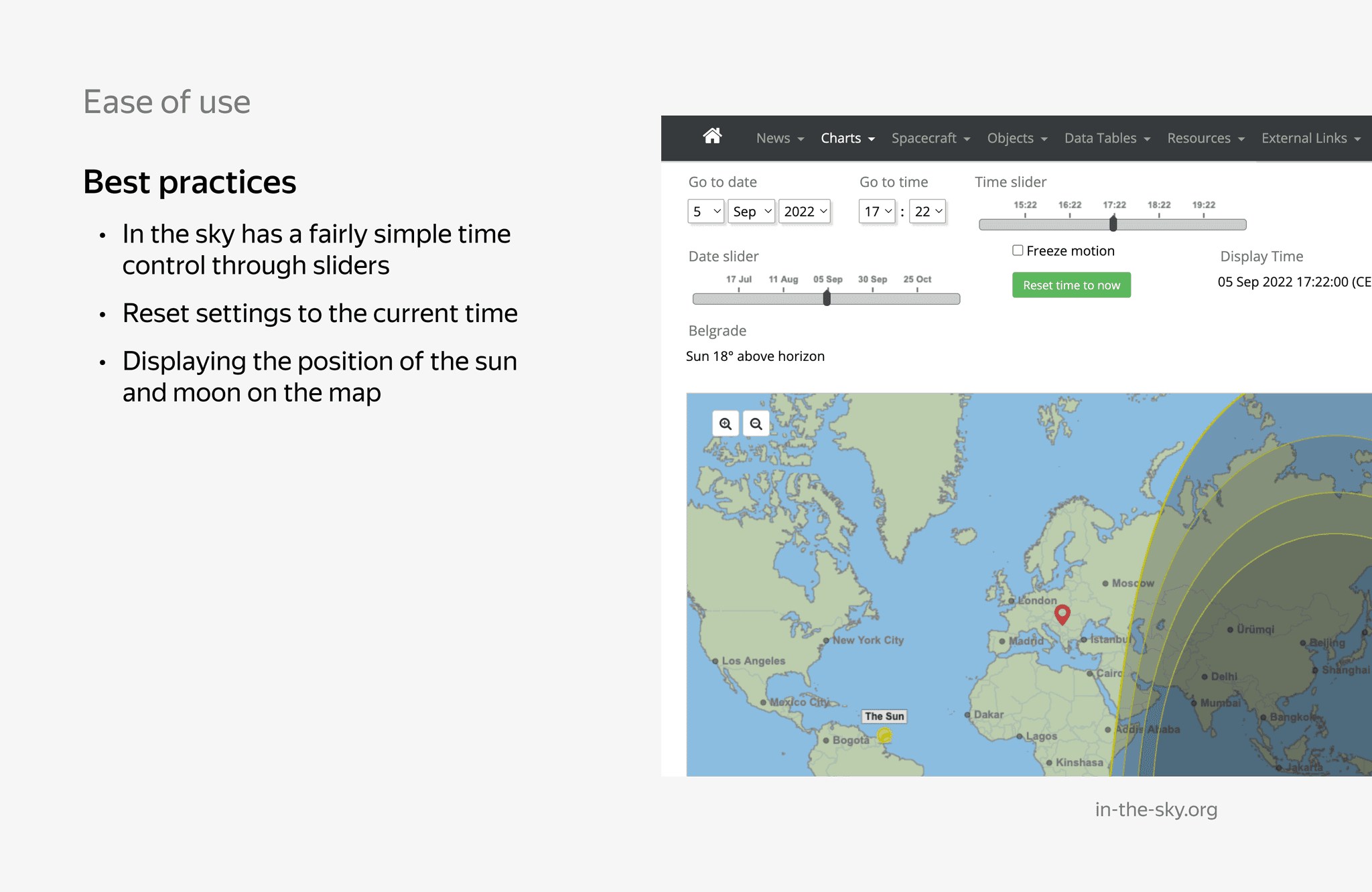
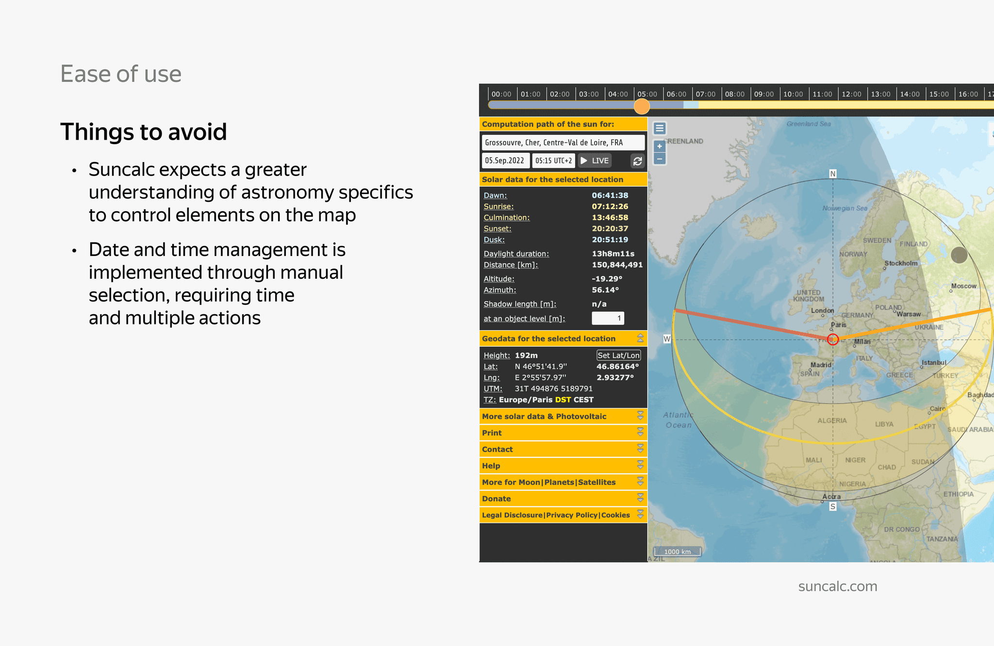
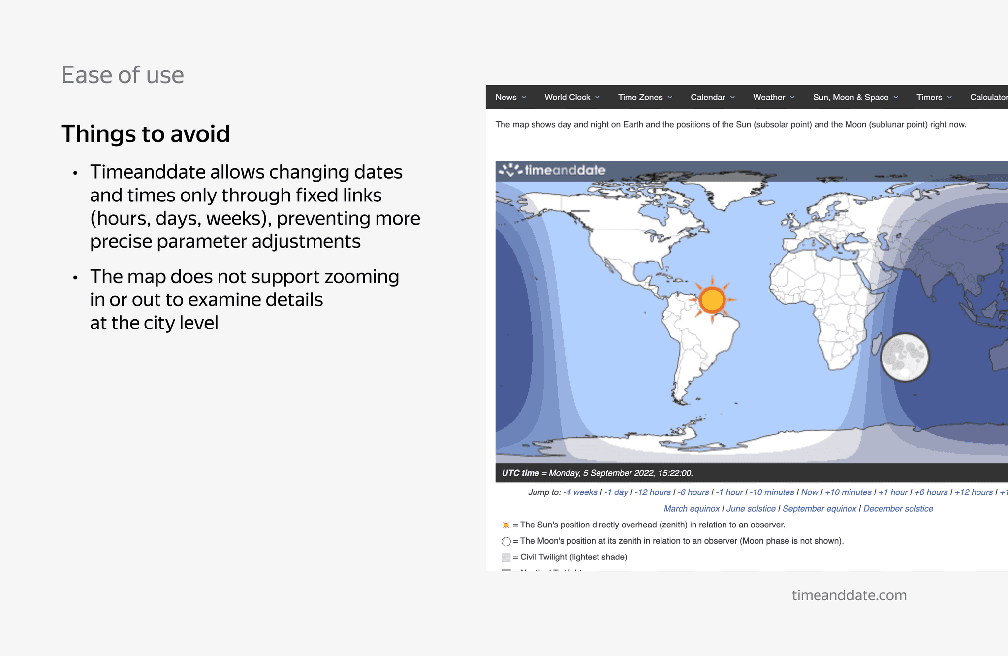
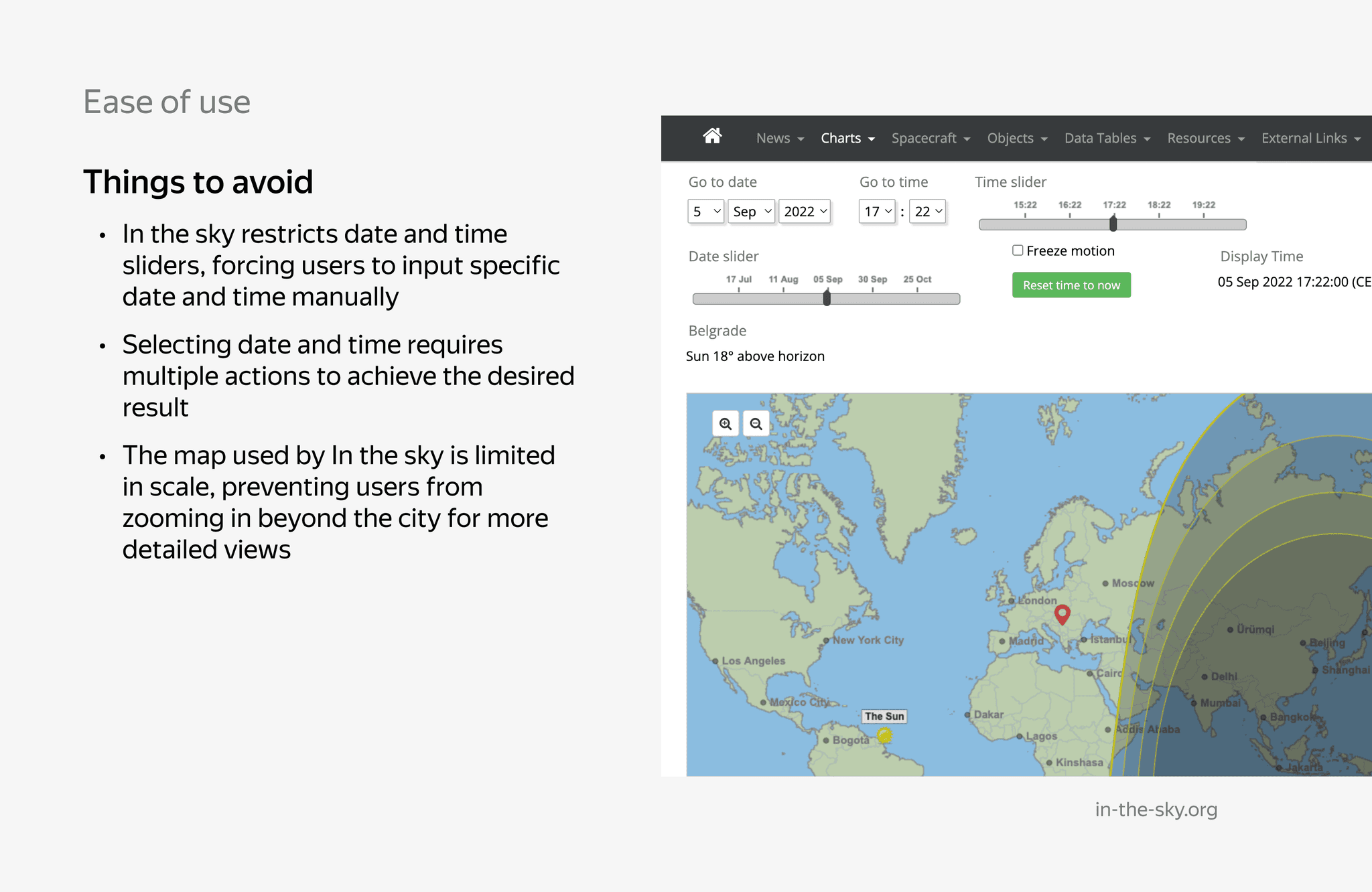
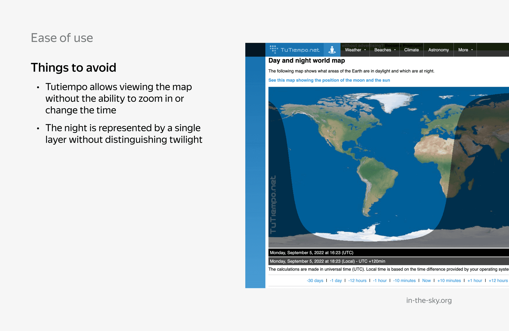
I conducted a comprehensive research of existing solutions with similar feature based on the top results from Google and Yandex Search, considering design features, visual style, interface, and user experience. Based on my findings, I came up with best practices, and things to avoid and recommendations in order to maximize the user experience.
Design
In my research, I found that existing solutions with similar functionality were too complex and required too many steps from the user.
To address this, I focused on creating a simpler solution that would be easier to use. I also looked for inspiration in existing solutions from related areas and even from tv series. I took my solution to a design critique session to get feedback before testing it on users.
Person of Interest, TV Series
Yandex Weather
User testing
Due to time constraints, we couldn't conduct our usual user testing. Instead, we opted for a hallway research approach, interviewing 7 coworkers from a different product team who had varying levels of technical proficiency.
By gaining their insights into their understanding of astronomy and the prototype's clarity, we were able to identify areas for improvement, particularly regarding the use of specific astronomical terms and the differentiation between time periods. Their feedback played an important role in enhancing the user experience of the design.
Selected Improvements
The previous dark tones led to misperceptions, where users assumed all dark areas represented nighttime. To fix this, I revised color palette offering a more differentiated and accurate representation of the time periods.
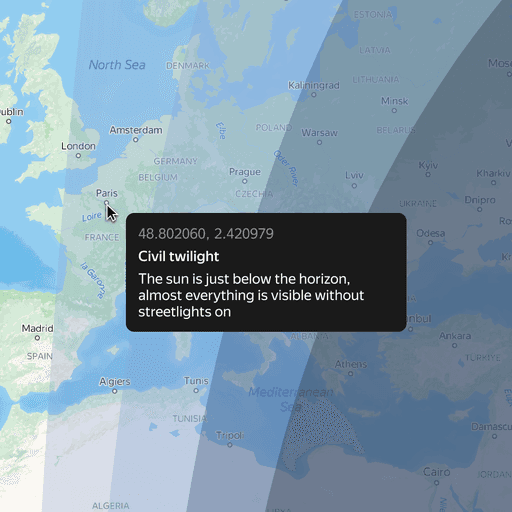
Not a single respondent knew what civil or astronomical twilight meant, so we added descriptions for each term.
Results
Outcome
The feature was launched in December 21 2022, in day of the winter solstice. It occurs when either of Earth's poles reaches its maximum tilt away from the Sun. This happens twice yearly, once in each hemisphere (Northern and Southern). For that hemisphere, the winter solstice is the day with the shortest period of daylight and longest night of the year, when the Sun is at its lowest daily maximum elevation in the sky.

The launch garnered coverage from 57 publications, including VC, Habr, and TACC. The overall media reach reached 24,000, while the total social network reach surpassed 500,000, with over 200,000 from two bloggers, and the rest being organic.
The team also gained backing from the professional community, with the Moscow Planetarium endorsing the launch. Russia's most widely recognized astronomer, Vladimir Surdin, discussed this feature in his astronomy YouTube podcast.
Takeaways
The project's novelty made anticipating its outcome difficult. In my opinion, it unlocked potentially beneficial, yet rarely explored, educational aspects. Participants in corridor research voiced their desire for features like weather and local time.
Regardless of day or night, the map inspires exploration. Knowing the time in a region that piques your curiosity, even if it's far from your current location, would be fascinating. Time zones can be tricky, making accurate time estimation a challenge. This applies to weather information like temperature and precipitation as well.
The map's information can spark a chain of questions, and the product can be the guide to finding the answers. Time zones are already represented as labeled regions, and weather as a layer of information on the map (Yandex Weather).
